CTA: Getting more people to hit apply
Action
Resolved critical issues that prevented prospective students from applying to our programs.
Impact
More apply button clicks and submissions of the application form, and less confusion from prospective students about basic program details.
Skills: heuristic evaluation, competitive analysis, workshop facilitation, stakeholder interviews, survey design, usability testing, data synthesis, ux design, ui design, brand implementation, design systems, project management
Note: Some content on this page has been generalized, recreated, or omitted to comply with confidentiality agreements.
Summary
Impact
We observed an increase in apply button clicks and submissions of the application form. The Admissions team also reported less confusion from prospective students about basic program details like cost, the admissions timeline, and how to apply.
Context
My company's main product: B2B and B2C technical training programs for upskilling or career-switching adults to learn software engineering, product design, and product management.
My role: As the sole Product Designer in my company, I owned the entire process end-to-end: I conducted research, identified problems, designed and implemented solutions, and measured their impact. I designed mockups in Figma, and developed the solutions myself in Webflow, the low-code site builder that hosted our site.
The B2C team approached me with the following goals:
- Reduce the number of basic, surface-level questions that Admissions staff had to field from prospective students, so they could spend more time on high value activities to enhance the admissions process
- Increase the number of students applying for each cohort of our software engineering training programs
Process
I combined a variety of research methods to collect a mix of quantitative and qualitative data. After this, I made updates to the site's content and design, and collected feedback from stakeholders in an iterative process.
Key insights
The research uncovered 95 unique issues. Roughly 28% of these issues were classified as "mission-critical" i.e. issues that could make-or-break whether a visitor ever made it to our program application form. When I sorted the issues by theme, I found that the majority of them were issues related to information coherency.
Example 1: call-to-action buttons did not clearly signal what action they would perform when clicked
Example 2: it was easy to confuse a large number in the hero of one of our pages as being the tuition of the program, when this is not what the number signified (and the actual tuition was much lower)
Solutions
I redesigned the CTAs and made the admissions process clearer, and reduced the number of clicks it took to apply.
I made information about costs more transparent by adding tax-inclusion labels to prices. I moved the average expected salary section and updated its design to make it clearer what the figure represented.
Deep dive
Context
The company
My company's main product: B2B and B2C technical training programs for upskilling or career-switching adults to learn software engineering, product design, and product management.
My role
Job title: Product Designer | Teams involved: Product, B2C
The company's public website had previously been managed by the marketing teams, and updated by a contractor. When I joined the company as their first full-time, in-house Product Designer, the site was handed over to me to manage.
As the sole designer in my company, I owned the entire process end-to-end: I conducted research, identified problems, designed and implemented solutions, and measured their impact. I designed mockups in Figma, and developed the solutions myself in Webflow, the low-code site builder that hosted our site.
I managed this project as a cross-team collaboration between the Product and B2C teams.
The challenge
The B2C team approached me with the following goals:
- Reduce the number of basic, surface-level questions that Admissions staff had to field from prospective students, so they could spend more time on high value activities to enhance the admissions process
- Increase the number of students applying for each cohort of our software engineering training programs
Before I joined the team, the website had never been evaluated holistically. Updates were generally made without a design process in place, and little user feedback to go off of – just stakeholder vibes and assumptions. There was also rarely an evaluation of whether an implemented change had actually solved the problem that had inspired it in the first place. This lack of end-to-end design process was completely understandable given the limited resources available: before me, there was no designer, and other staff had very little time to dedicate to design work.
This is why I decided that my first step would be to do some general sitewide research. I needed to figure out how users currently interacted with the site, and how they felt about it. After this, I would come up with solutions to get us closer to achieving the goals stated above. Due to the time constraints of this project, I was particularly focused on identifying the low-hanging fruit: changes that wouldn't require much effort, but would result in a huge payoff.
Process
Research and data analysis
- Competitive analysis workshop
- Stakeholder interviews
- Custom internal surveys
- Usability studies
- Heuristic evaluation
Note: This research was done for the entire site, including the B2B side. More information on the B2B findings and solutions can be found in my other project: Increasing B2B traffic: The power of navigation. This case study will focus on the relevant B2C findings.
Workflow
- Conducted research, evaluated data, and distilled insights
- Made updates and collected feedback from stakeholders in an iterative process
Key insights
The research uncovered 95 unique issues. Roughly 28% of these issues were classified as "mission-critical" i.e. issues that could make-or-break whether a visitor ever made it to our program application form. When I sorted the issues by theme, I found that the majority of them were issues related to information coherency.
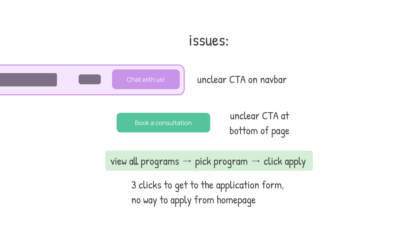
Example 1: multiple users did not understand what each call-to-action (CTA) button would do when clicked, which meant they did not know how to get to the application form. Some people thought that the "Book a Consultation" button was a necessary step to complete before applying – even though it wasn't – just because of its positioning close to the end of the page. This inserted an imaginary extra step in the application process, adding perceived friction to the act of applying.
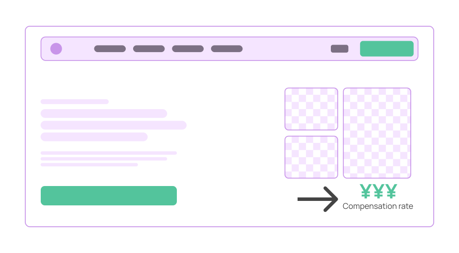
Example 2: multiple users who skimmed a page mistook the meaning of a crucial number. We had a number advertised on our page as the average salary of previous program graduates – but this figure was mistaken to be the tuition of our program. This was bad, because the actual tuition cost was far lower. This meant users were abandoning the application process early on, by assuming they were priced out of our program.
Solutions
To address the most critical issues affecting the application pipeline, I designed and implemented multiple changes across the B2C site. Below are some of the highlights.
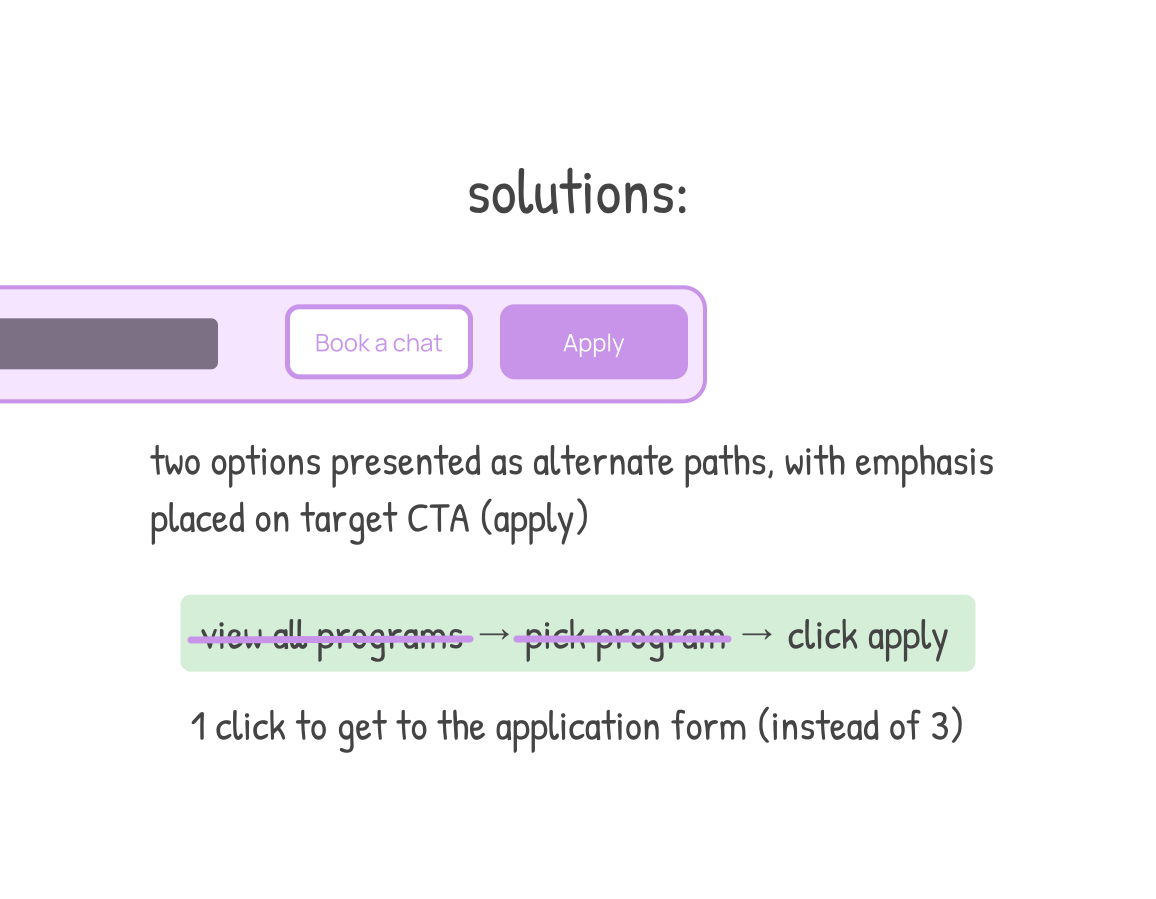
I redesigned the CTAs and made the application process clearer:
- Added an apply button to the navigation bar, where it was always visible and took a single click to access. Previously, it was buried behind multiple clicks through different pages.
- Updated the "Book a Consultation" button: changed the copy to suit our English brand's more casual voice with "Book a Chat", and placed this button right beside the "Apply" button, but styled as a secondary action. This way, the apply button would still grab the most attention due to its bright color and positioning, and the chat button would feel optional, or less important.
- Added an admissions timeline explanation and diagram to the apply page.
I made information about costs more transparent:
- Added tax-inclusion labels to prices, so the final cost of each program was clear
- Moved and updated the design of the average expected salary section so that it was clear what the monetary figure being shown was, and to avoid it being confused with tuition
Impact
Following these changes, we observed an increase in apply button clicks and submissions of the application form via our analytics platforms – meaning more potential students were entering the admissions pipeline for our programs. The Admissions team also reported less confusion from prospective students about basic program details like cost, the admissions timeline, and how to apply.