Increasing B2B traffic: The power of navigation
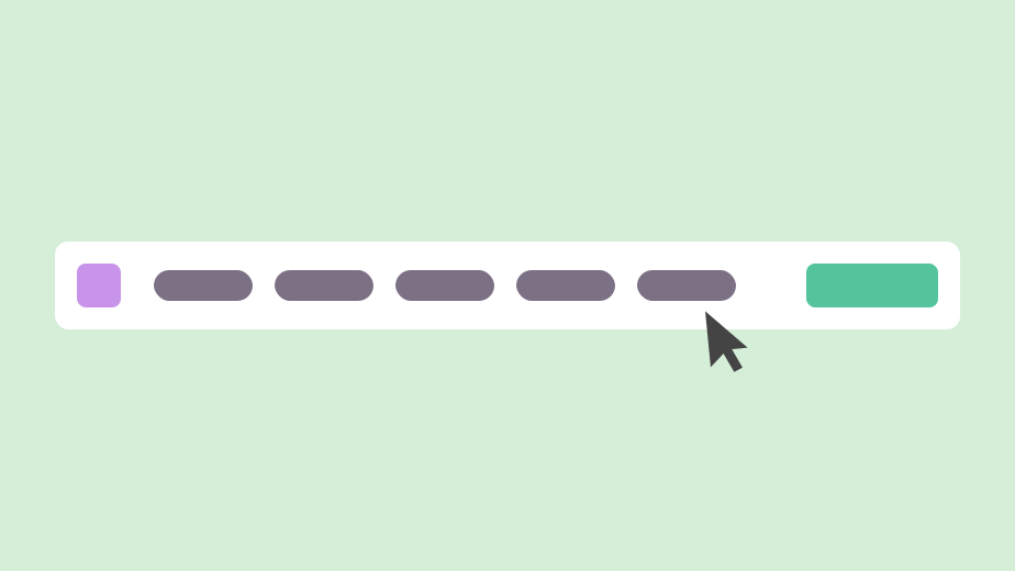
Action
Redesigned navigation, designed new pages, and updated B2B design system to align with new branding.
Impact
Higher traffic to our B2B pages, and better engagement (scroll percentage and clicks).
Skills: heuristic evaluation, competitive analysis, workshop facilitation, stakeholder interviews, survey design, usability testing, data synthesis, information architecture, ux design, ui design, brand implementation, design systems, project management
Note: Some content on this page has been generalized, recreated, or omitted to comply with confidentiality agreements.
Summary
Impact
After these updates, we observed a higher average scroll percentage and a higher average number of clicks on our redesigned B2B pages. The website analytics also confirmed that our navigation update was a success: we now had a significantly higher number of users landing on our B2B pages, and many clicks on our new B2C → B2B navigation link.
Context
My company's main product: B2B and B2C technical training programs for upskilling or career-switching adults to learn software engineering, product design, and product management.
My role: As the sole Product Designer in my company, I owned the entire process end-to-end: I conducted research, identified problems, designed and implemented solutions, and measured their impact. I designed mockups in Figma, and developed the solutions myself in Webflow, the low-code site builder that hosted our site.
The company was looking to expand the scope of its B2B offerings and target a wider range of clients. In support of this, the B2B team wanted to better leverage our website to promote our services to prospective customers. Their goals: add more pages, redesign existing pages, and increase traffic to the B2B side of the site.
Process
I combined a variety of research methods to collect a mix of quantitative and qualitative data. After this, I made updates to the site's content and design, and collected feedback from stakeholders in an iterative process. I held weekly syncs with the B2B Marketing Manager to communicate about the project.
Key insights
The research surfaced a discoverability problem with our B2B site. Given that the navigation issues causing this were observed multiple times in my research, my hypothesis was this: creating a clearer path from the B2C side of the site to the B2B side would result in higher traffic to our B2B pages.
Solutions
After the B2C and B2B teams confirmed that localizing content was not a priority, I removed the language toggle entirely and replaced it with navigation bar links to switch between the B2C/English and B2B/Japanese sides of the site. This approach was chosen to prioritize visibility in each target audience's primary language.
Deep dive
Context
The company
My company's main product: B2B and B2C technical training programs for upskilling or career-switching adults to learn software engineering, product design, and product management. Our primary B2B client was a global enterprise automotive company.
My role
Job title: Product Designer | Teams involved: Product, B2B
The company's public website had previously been managed by the marketing teams, and updated by a contractor. When I joined the company as their first full-time, in-house Product Designer, the site was handed over to me to manage.
As the sole designer in my company, I owned the entire process end-to-end: I conducted research, identified problems, designed and implemented solutions, and measured their impact. I designed mockups in Figma, and developed the solutions myself in Webflow, the low-code site builder that hosted our site.
I managed this project as a cross-team collaboration between the Product and B2B teams. Website copy and media (images/video assets) were supplied to me by the B2B Marketing team.
The challenge
The company was looking to expand the scope of its B2B offerings and target a wider range of clients. In support of this, the B2B team wanted to better leverage our website to promote our services to prospective customers.
With this in mind, the B2B team approached me with the following goals:
- Redesign existing pages and add new pages to explain our offerings in detail
- Redesign the B2B side of the site to match our new branding guidelines
- Increase the number of users landing on our B2B pages
The first two goals were fairly straightforward, as I already had an existing design system to build from – it just required updates, as well as some rethinking of the site's information hierarchy.
The third goal, however, would require some investigation: thus far, the B2B side of our site – which existed on the same domain as our B2C site – had gotten little traffic, significantly less compared to the B2C side.
I needed to figure out why this gap existed, and how to close it.
Process
Research and data analysis
- Competitive analysis workshop
- Stakeholder interviews
- Custom internal surveys
- Usability studies
- Heuristic evaluation
Note: This research was done for the entire site, including the B2C side. More information on the B2C findings and solutions can be found in my other project: CTA: Getting more people to hit apply. This case study will focus on the relevant B2B findings.
Workflow
- Conducted research, evaluated data, and distilled insights
- Held weekly syncs with the B2B Marketing Manager
- Made updates and collected feedback from stakeholders in an iterative process
- Implemented new brand guidelines into the design system
- Redesigned existing pages
- Designed and created new pages
- Made updates to information hierarchy and navigation
Key insights
What we learned
The research surfaced a discoverability problem: our B2C site was the default homepage and outranked B2B in search. Our B2C branch of the business had been around much longer than our B2B branch.
This meant that many users ended up on the site homepage via search, and experienced one of the following issues:
- They did not know our company had a B2B department, since our default homepage only advertised B2C
- They did not know where to find information about our B2B business, even once they were on our homepage
- Limited information was available on the B2C side of the site about the B2B business – the only way to access detailed information about B2B offerings was to visit the B2B side of the site
- The only way to switch to the B2B side of the site was to click on a Japanese flag icon that was actually a language toggle. Clicking on this flag would switch the flag to an American flag, and take you to the B2B side of the site (and simultaneously switch the language of all text from English to Japanese).
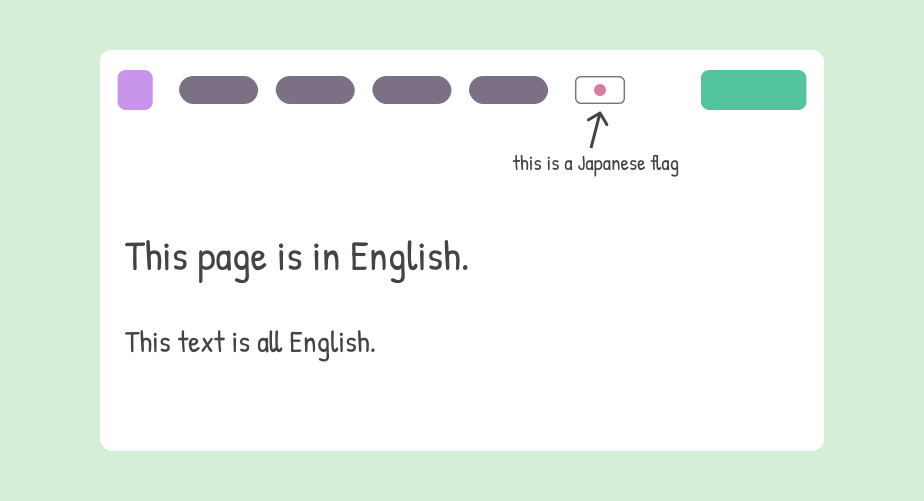
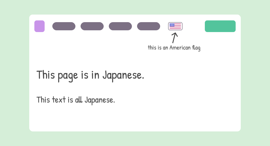
This was likely implemented this way originally because our B2C business audience primarily spoke English, and our B2B business audience primarily spoke Japanese.
While this may have made sense back when the site was first created, there were multiple issues with this behavior now:
- The flag icon looked like it signaled "current state", when it actually signaled the "desired state" a user might want to switch to. On English B2C pages, the flag was a Japanese flag. On Japanese B2B pages, the flag was an American flag. This was confusing and the opposite of what a user might expect according to design best practices.
- We were assuming that an internal assumption within our company (language being linked to business type) would be understood by prospective customers visiting our site. Users did not understand this implicit link.
- It's possible that users would think that the flag indicated region, and not language preference – especially since we also had programs that were online.
The takeaway
Given that the above issues were encountered and flagged multiple times in my research, my hypothesis was this: creating a clearer path from the B2C side of the site to the B2B side would result in higher traffic to our B2B pages.
Solutions
The language/business toggle needed to be redesigned.
The first step was talking to the B2C and B2B Marketing teams about making their content available in other languages. They confirmed that localizing all content was not a priority – they were happy keeping most B2C pages English, and most B2B pages Japanese.
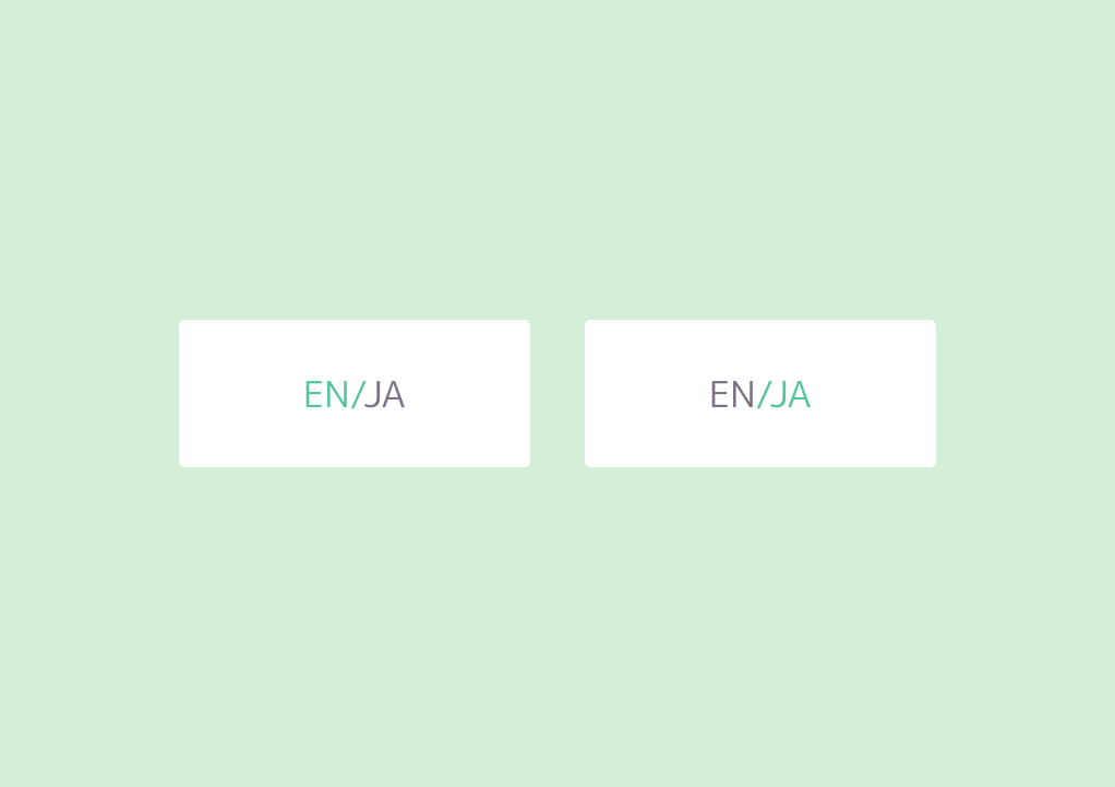
I removed the confusing flag icon language toggle and replaced it with a simple text toggle that conditionally displayed only on pages that had content in both languages. Unlike the flag icon, the text toggle clearly let the user know the current state. When on a Japanese page, the toggle showed "JA" highlighted, and "EN" grayed out.
Next, I needed to design a mechanism to switch between B2C and B2B. After some rounds of iteration and feedback with internal stakeholders, I ended up adding a link to the navigation bar. On the B2C/English site, this link would have Japanese copy and display an English tooltip on hover. On the B2B/Japanese site, this link would have English copy and display a Japanese tooltip on hover.
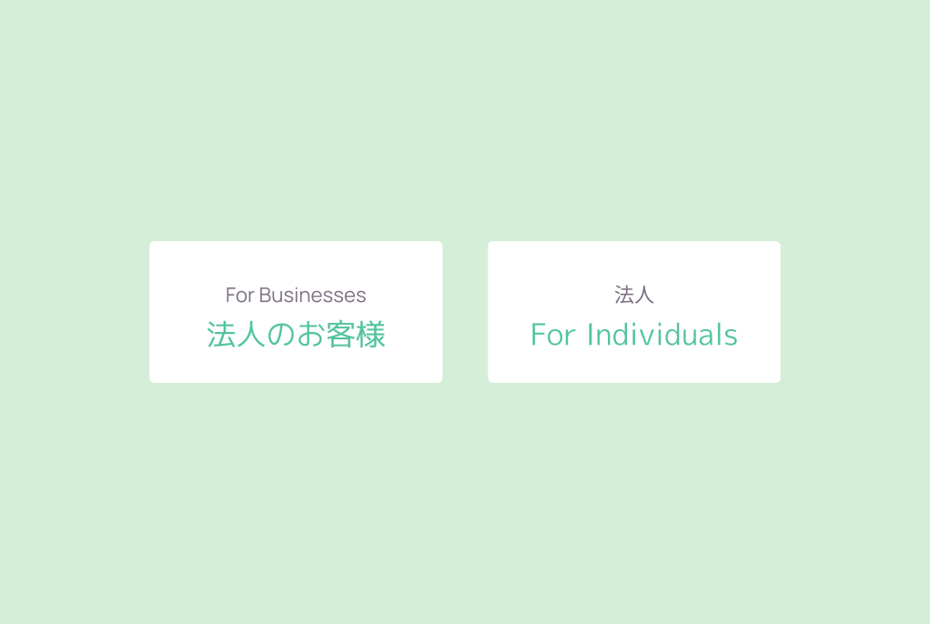
The benefit of this approach: it prioritized visibility in each target audience's primary language. A Japanese speaker landing on our English site would immediately be drawn to a link written in Japanese.
The drawback of this approach: people on the B2C side who didn't speak Japanese could be confused seeing a link in a language they could not read. I mitigated this by adding the tooltip that would show a translation of the link text, once the user got curious enough to hover over the link.
Given more time to work on the redesign of this particular feature, I would have loved to further improve this design's legibility to all users, no matter what combination of languages they spoke and what information they were seeking on our website. However, having gotten approval from stakeholders and having no time left for further iteration, this was the final design I implemented.
Impact
The B2B Marketing Manager and I reviewed our website analytics in the months that followed these updates, and noted a higher average scroll percentage and a higher average number of clicks on our redesigned B2B pages.
The website analytics also confirmed that our navigation update was a success: we now had a significantly higher number of users landing on our B2B pages, and many clicks on our new B2C → B2B navigation link.